Pieces

Pieces is a HealthTech company that creates products rich with functionality and cutting-edge, artificial intelligence-based technology. The complexity and depth of their products—paired with having multiple audiences—made messaging difficult. Their outbound communication and identity were a bit scattered and felt dated.

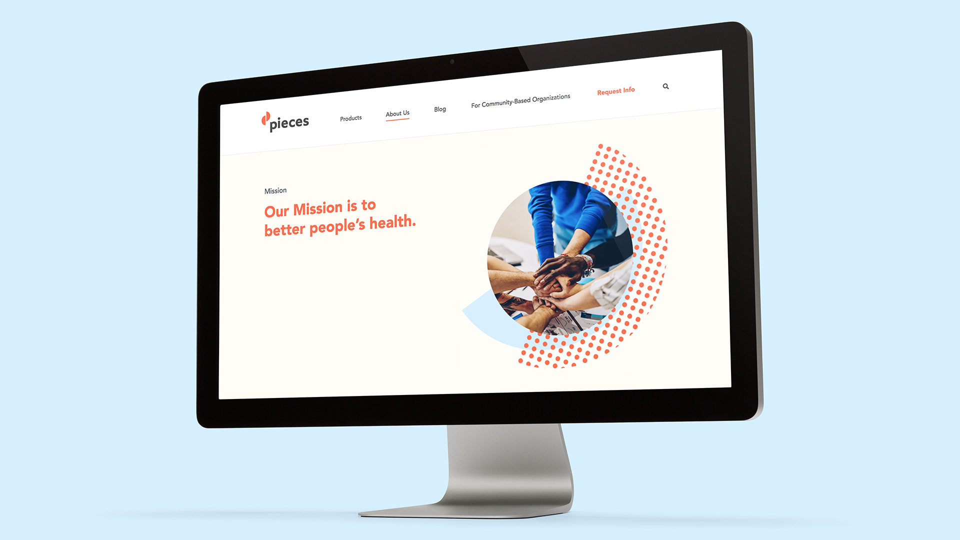
BrowneMusser’s research helped clarify Piece’s overall mission and led to the creation of a communication strategy. We then designed a new logo and identity system, renamed their products, launched a new website, and then redesigned all their sales materials.

Their unified brand and product strategy have enabled easier communication, facilitated new product roll-outs, and positioned them to more accurately reflect their position in the market.

Pieces_Mark.jpg
Pieces_Cup.jpg
PiecesLogo.gif
Pieces_Pins.jpeg
PiecesOffice.png

Cohesive naming

We developed a naming strategy so their products held together as a family.

A comprehensive brand system

We created a robust branding system around the new logo. Through color and pattern, we were able to unite all their materials under one visual identity system. From sales collateral to infographics, everything is now unmistakenly Pieces.

Pieces_SalesMaterials1.png
Pieces_Patterns.gif
Letterhead 0426 2020-09-14_1_2_3_4.jpeg
infographic 1.jpeg
Letterhead 0426 2020-09-14_1_2_3_4_5.jpeg
 

A new website

We reconceived Pieces’ website to address their multiple audiences—Health systems, community organizations, and people in those communities—and clarified their unique position in the market.

PiecesWeb1.png
PiecesWeb4.png
PiecesWeb5 copy.png
PiecesWeb3.png

We created a system of icons to complement content for web, collateral, and presentations.

 
Pieces_Icons.png
 

Style Guides are an integral part of helping our clients stay on brand. We know we won’t create every piece of communication, so a robust guide is almost always needed.

 
Pieces_StyleGuide.png
Previous
Previous

Vor Bio

Next
Next

Sonoma Bio