
Alameda County Health
Alameda County Health is the local government agency that promotes and protects the health and well-being of all who live, work, learn, and play in Alameda County. We worked with the County to look fundamentally at its brand, identity, and naming structure. We are now in the process of collapsing, reorganizing, and redesigning their web presence across the agency and its departments.
The overall goal was to make it easier for residents to find the services they were looking for. We wanted them to understand that the wide diversity of available programs and services was available through one unified organization.
Communication Strategy
After doing extensive research across the agency and with its community partners, we developed brand pillars and a “Big Organizing Principle” that encapsulates the meaning and purpose of the organization’s work. This principle became the touchstone for all future development.
Health for all.
Naming
The organization was previously known as Alameda County Health Care Services Agency and often abbreviated to HCSA.
Additionally, its departments were named inconsistently with variants from “Department of…” to “...Department” to “...Health Care Services.” We simplified and brought consistency to their naming structure. The organization was renamed Alameda County Health and the departments are Behavioral Health Department, Environmental Health Department, and Public Health Department.
Identity
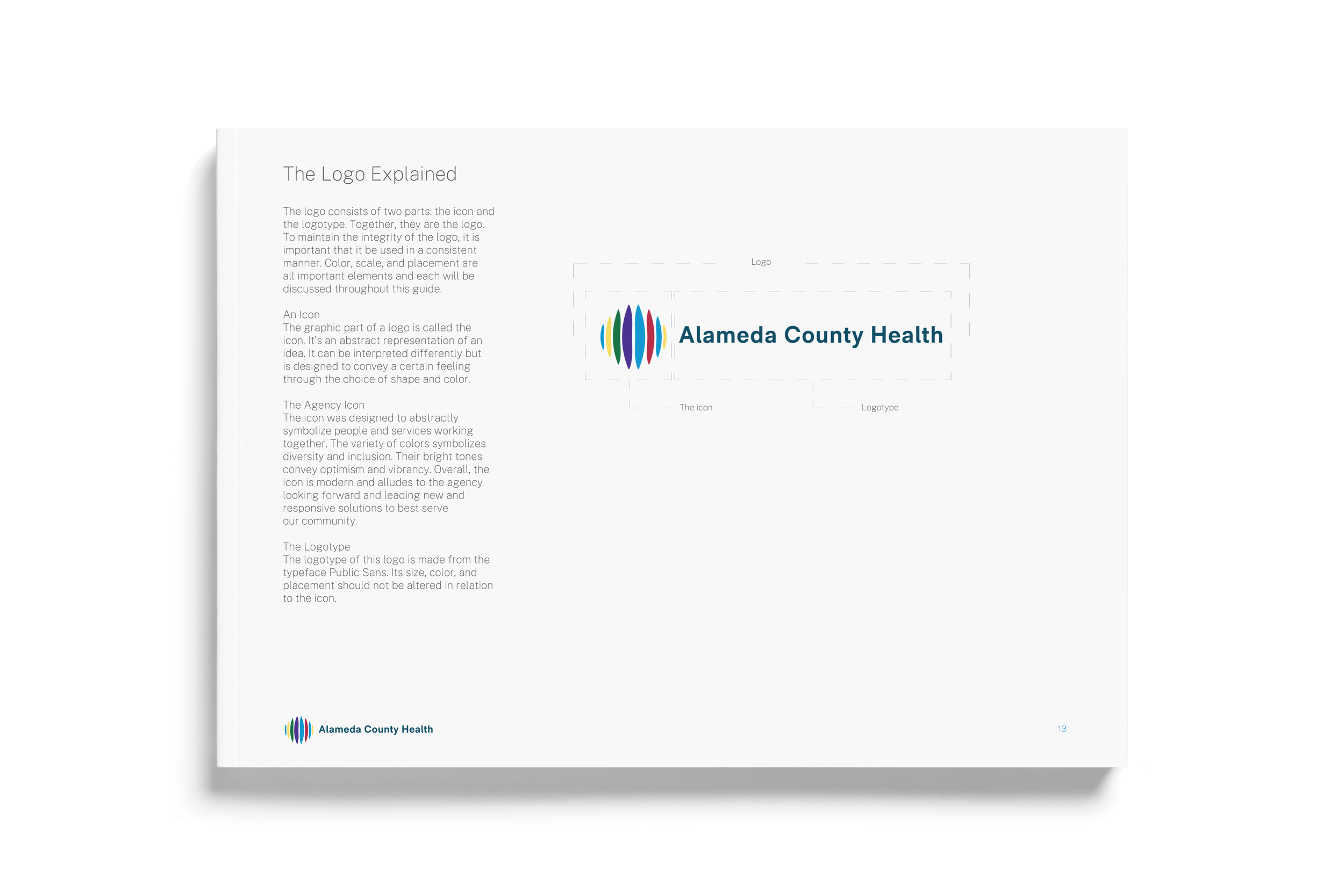
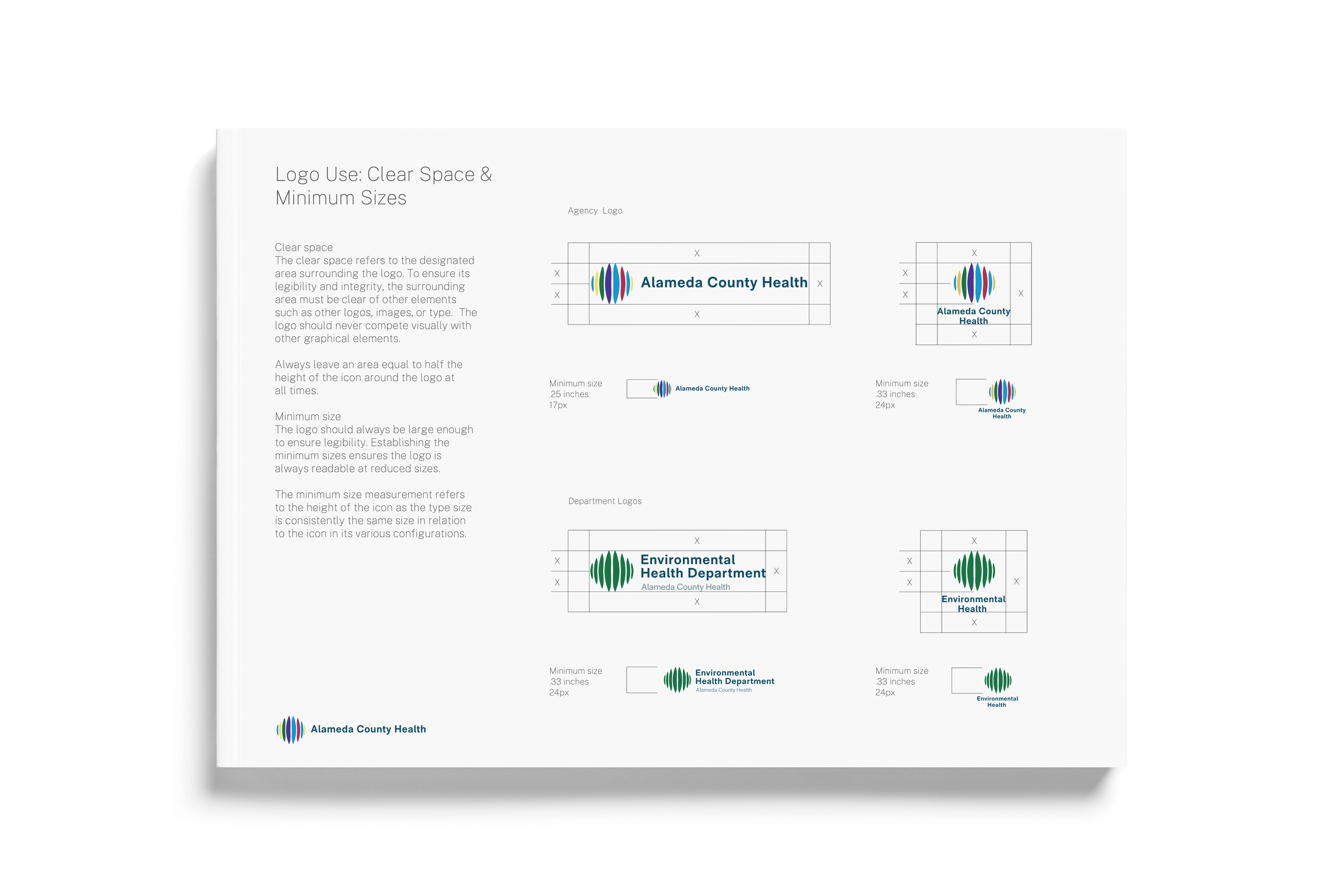
From a design perspective, there was also no relationship between the logos for the Agency and the individual departments. We strove to create an identity design system that made it clear that the departments and agency were related and part of one organization.
The primary icon expresses community and the various elements working together in harmony. It also is modern to better communicate being current to the needs of the communities they serve. The Agency logo is multicolored to represent the inclusion of the departments. The icon for each department has its own principal color. In addition, a single unified font is used throughout all materials to bring consistency and unity to the brand.
“Thanks to an iterative and deeply collaborative process, the BrowneMusser team fully delivered on a unified brand that also honors the diversity of our departments. Our staff and partners are loving the fresh new look, and we’re excited to share it with the community.”
Aneeka Chaudhry
Assistant Agency Director | Systems & Policy
Alameda County Health